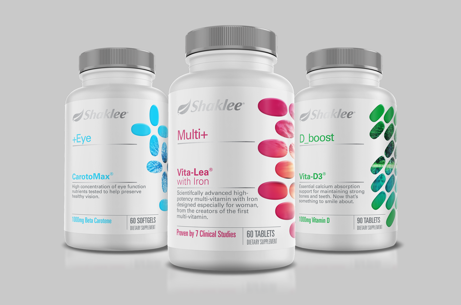
Shaklee Nutrition
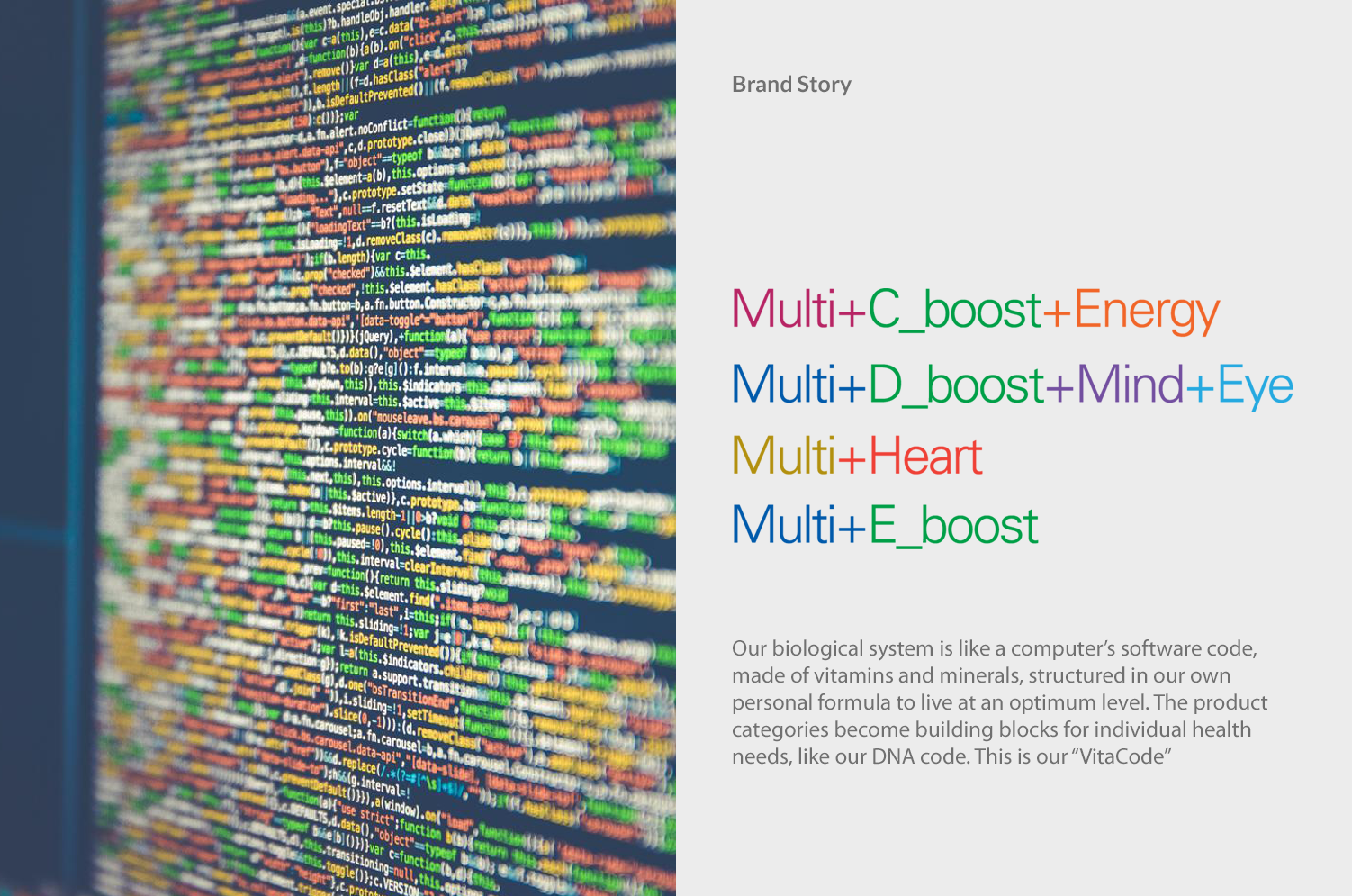
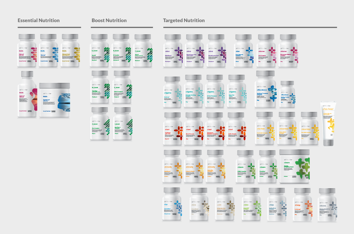
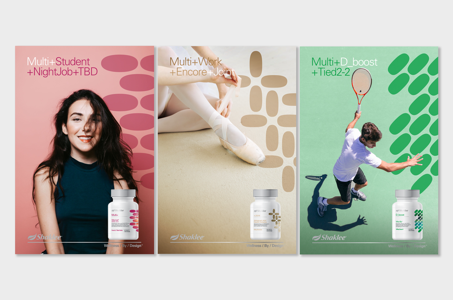
Shaklee worked with Thermostat to redesign their whole line of nutritional supplements. Initially this project was a small evolution to the core set of products, however during our discovery and strategy stage, I discovered challenges with the existing product tiering and how they sell the products. I recommended a three-tier structure that was built on "use" versus "ingredient," which aligned with current trends, and also helped distributors sell products to their customers with a logical and emotive brand story. I ended up designing the whole family of nutritional supplements and provided a system for their internal creative team to implement to all the remaining SKUs overtime.

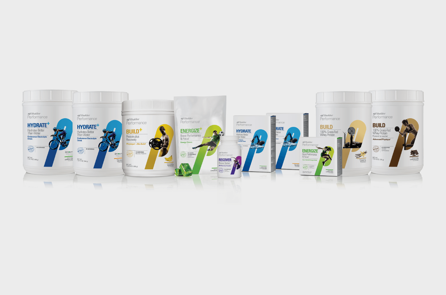
Shaklee Performance Nutrition
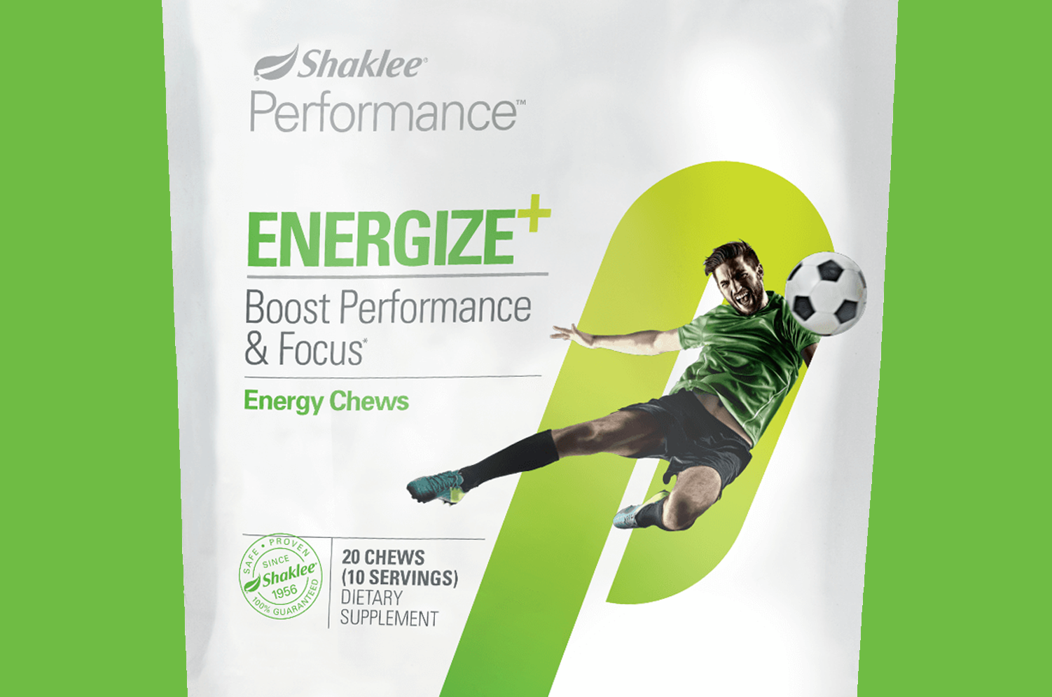
Shaklee Performance is a new revitalized nutrition offering for better sports nutrition. I designed a tierring strategy to help position each product within a different stage of working out to aid the consumer in purchasing the correct product for their needs. An energetic letter “P” holds the athlete as they burst out, to communicate the product benefits. This is balanced by a clinical layout to reinforce the efficacy. While working at Turner Duckworth I worked with Shaklee on redesigning their green cleaning products, branded "Get Clean". This brand speaks to the synergy of nature and cleaning, benefiting each other. It was also positioned to target a younger demographic and increase members.
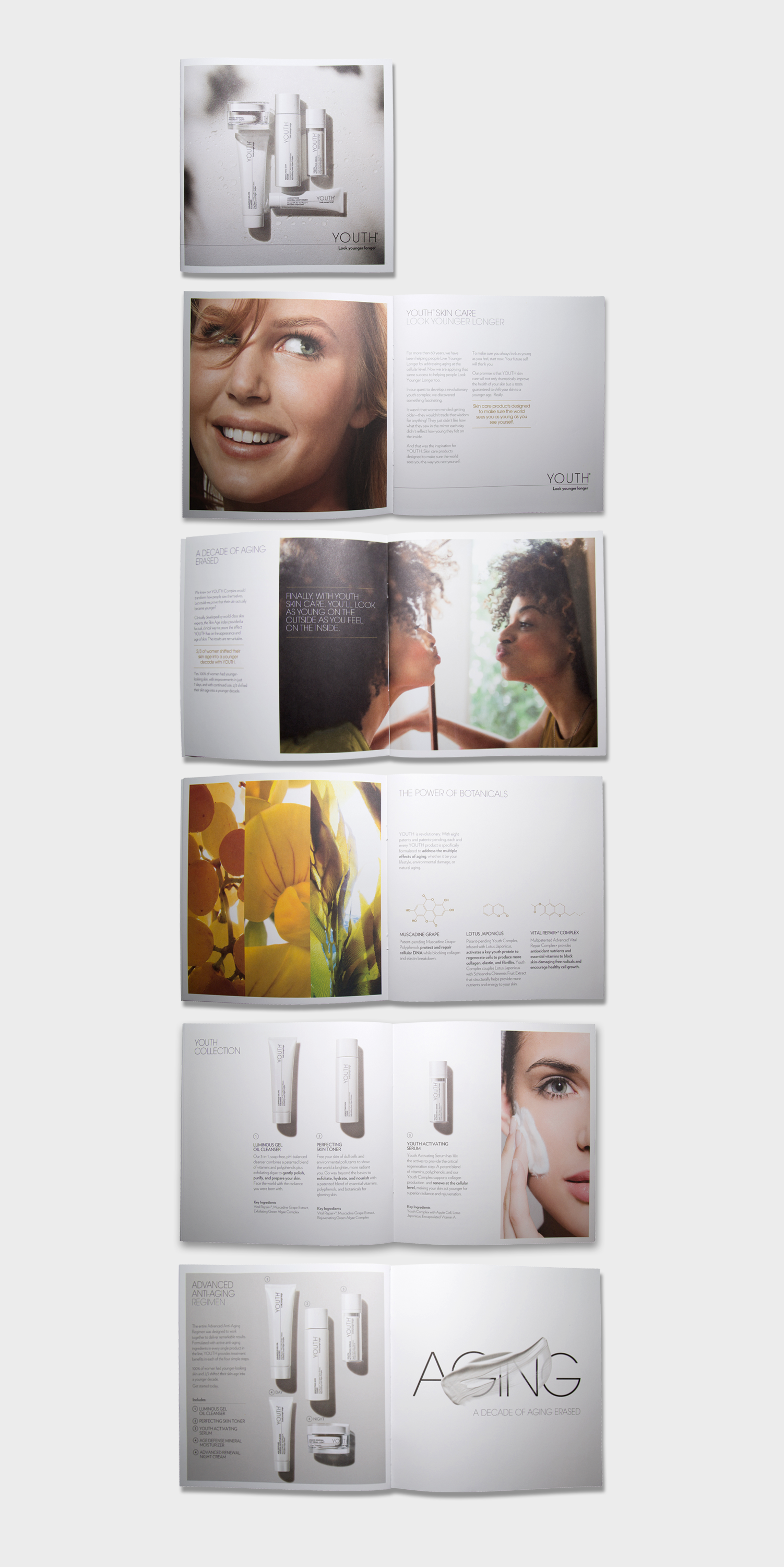
Youth by Shaklee
Shaklee also launched a new beauty line called Youth and asked Thermostat to design the launch brochure and supporting collateral. We art directed the photoshoots and designed this brochure.